The Journey Behind Discovering ProtoPie
Tony shares his story behind how he went from Google designer to discovering ProtoPie.

At Google, designers are called “luxury resources.”
There are innumerable ongoing projects at Google, but not every project has a designer onboard, hence the moniker. Many of these projects either tackle technical challenges, and in other cases, developers rely solely on internal design guidelines and design libraries. Subsequently, designers are known to simultaneously work on numerous projects, and at one point in time, an opening for a designer position at Google stated “the ability to juggle” in the opening’s job description.
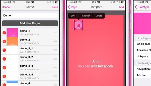
I too have worked on more than two projects simultaneously during my time at Google. I have even juggled with five projects at the same time, albeit temporarily. It goes without saying that prototypes can be highly effective for explaining design ideas to project managers or engineers. While I had the coding capability to modify code written by others or write my own code to create a prototype, there was always a shortage of work time, making it difficult to set time aside for coding. POP (Prototyping on Paper) was well-received at one point in time, but such prototypes could not be feasibly used for anything beyond checking for flow, as they were click-through prototypes made by taking snapshots of hand-sketched drawings. At that time, there weren’t any tools that designers could easily use and create visually rich prototypes with numerous effects. I was inspired to make such a tool after talking to a close engineer. A few months later, I created a prototyping tool targeting mobile devices called App.eal, which played a major role in bringing ProtoPie to life over the past year and a half. App.eal allowed designers to import images made with graphic tools from Google Drive and create a high-fidelity prototype. The tool was the first-ever* of its type to feature automatic scrolling once an imported image’s height in the fixed header and fixed footer were set. More than anything else, however, I was able to confirm that there were many designers around the world who faced the same kind of hurdles I did.
I left Google to create a prototyping tool just as when prototyping tools were beginning to appear on the market. At that time, CoffeeScript by Framer was known for being a versatile prototyping tool capable of making anything, while Origami was attractive for being code-free. However, I thought that because both tools were either code-based or a visual programming tool, most designers had to approach them from a completely different angle in order to use them effectively. I started to ponder over an easy and natural model that designers can easily understand.
The search for easily accessible interactions and movements is not a new trend.
Jesse James Garrett defined Ajax for Rich Interaction Application in 2005 and Bill Scott spread it. At that time, I researched how to make possible the visualization of a user’s input and the input’s triggering of screen elements (relative to time) on a two-dimensional wireframe. (Design process improvement for effective rich interaction design, IASDR 2007) I believe that while visualizing on a wireframe does not require special tools, significant training is required, and common elements cannot be utilized in every case, requiring a more systematic and sophisticated method.
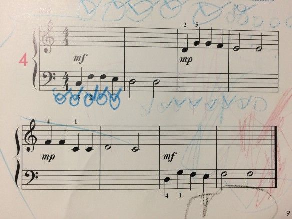
The answer turned out to be easily in my grasp. One weekend evening, I caught sight of my six-year-old son marking on his music sheets as he was practicing the piano. I realized that if I could replace symbols on a sheet denoting which key to press, which pitch to play in, or how long to hold a note, it would be possible to express interactions within a systematic framework. I looked into robotics papers about expressing movements made by robots, and how keyframes are defined in animation tools and placed in timelines to signify the movement of elements. I eventually found out that Pierre Beauchamp had researched methods of registering dance movements on paper in the 1680s, way before robotics had implemented similar concepts.
Musical notations and Beauchamp’s dance notations have the goal of presenting movement in a linear fashion relative to time. Subsequently, the sequence cannot be reversed. Interactions on devices can proceed in different, opposite ways depending on the user’s input and the input’s time and conditions, making it difficult to express interactions on a single-direction timeline. I concluded that creating interactions on a single-direction timeline seen in software packages like Adobe After Effects or Flash would not be feasible if these interactions were to be able to move in multiple directions.
The modernized dance notations by the EWMN Center or keyframes found in motion scores require movements to be categorized prior to usage. Just as dance notations split a human body into different parts, and the movements of each part are expressed in relation to time, I applied Dan Saffer’s Microinteraction concept model and finely disassembled an interaction. If a trigger can be found in even the most complex interaction, microinteractions can be divided into several nano-interactions based on the triggers’ positions. I followed up by gathering aspects that weren’t triggers. I named these aspects “Responses” so that I could differentiate them with user feedback. Analyzing the movements made up by the Responses presented numerous aspects repeating themselves.
Eureka! It turns out that interactions have elements, as well!
There is a seemingly infinite number of substances in the world, but they are made up from some 70 naturally occurring elements. If the bonding method of the elements involved in a substance is known (at least, theoretically speaking), it is possible to re-create the substance. For example, diamond and coal are both made up of carbon, but they are completely different as they feature different atomic structures.
The same analogy can be applied to movement. Even if something is moving a fixed distance, the speed at which it is moving (or the time during which movement takes place) and the acceleration can affect the movement. In other words, if speed and acceleration are removed, what is left is the basic element of movement. Movement is expressed via Move, Scale and Rotate, the most common elements.
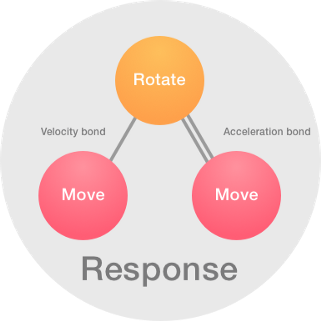
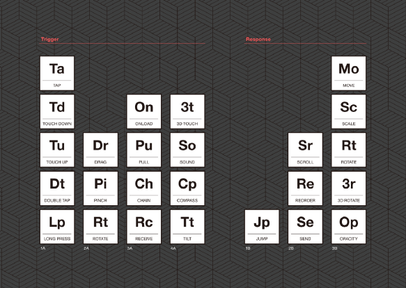
I analyzed each interaction found in the designs featured in the mobile app designs shared on Dribbble.com as part of verifying the interaction element model. The Response, a relevant part of movement, can be broken down into interaction elements, with the exception of Morphs. However, the Trigger in mobile apps features specific conditions, as unlike clicks made while surfing the Web, the Trigger can accept a wider variety of user input such as taps, double taps or long presses, and take elapsed time and system conditions in consideration. Subsequently, there was a need to disassemble the Trigger and analyze it further. The Periodic Table of the Elements turned out to be an excellent analogy. The elements in Group 1A, the leftmost column, are primarily alkaline with the exception of hydrogen, while the elements in Group 7A, the 17th column, are mostly acidic. On this note, Responses can be likened to elements in Group 7A, while Triggers are elements in Group 1A. I arranged all Trigger elements on the left, and all Response elements on the right, and organized the elements based on complexity in a table. The end result was a table highly similar to the periodic table. I gave the name “interaction piece” to the interaction elements as they are more than mere elements; they are materials for recombination.
My partners and I showcased our thoughts in a demonstration at Work-in-Progress in CHI 2015 under the name “SNAP,” and those present were uncomfortably excited. Subsequently, ProtoPie’s concept model was completed in the spring of 2015. Hence, I don’t assume that my team invented or created ProtoPie. Just like how Galileo discovered the geocentric theory in the 1600s, rather than inventing it, ProtoPie was discovered in nature through our team’s efforts. One year later, we presented ProtoPie in an open beta. I felt just like how I felt when my first son was born, alternating between happiness and worry.
The name “ProtoPie” is a portmanteau of the word “prototype” and the expression “a piece of pie.”
ProtoPie holds our belief that prototyping should be as delicious and as easy to make as pie. ProtoPie still has much to show, more than what it is capable of showing right now. Of course, there are many bugs that need to be tackled. However, the reason why we are confidently presenting an unfinished product is that we want to gain the feedback of real designers for a design tool that was created from a designer’s mindset. One Chinese proverb I really like is “细节决定成败.” This proverb means that the details determine success or failure. We continue prototyping even today in order to perfect the details of ProtoPie, a tool that can properly create your own details.
*Even though a patent for App.eal was filed, many tools appeared with similar feature sets, and instead of using patents to stop copycat efforts, the application for the patent was withdrawn as our expression of giving back to the design community.

