How Warner Bros. Discovery Uses ProtoPie for Product Innovation & Motion Design
Discover how the motion design team at Warner Bros. Discovery uses ProtoPie to quickly and easily create high-fidelity prototypes.

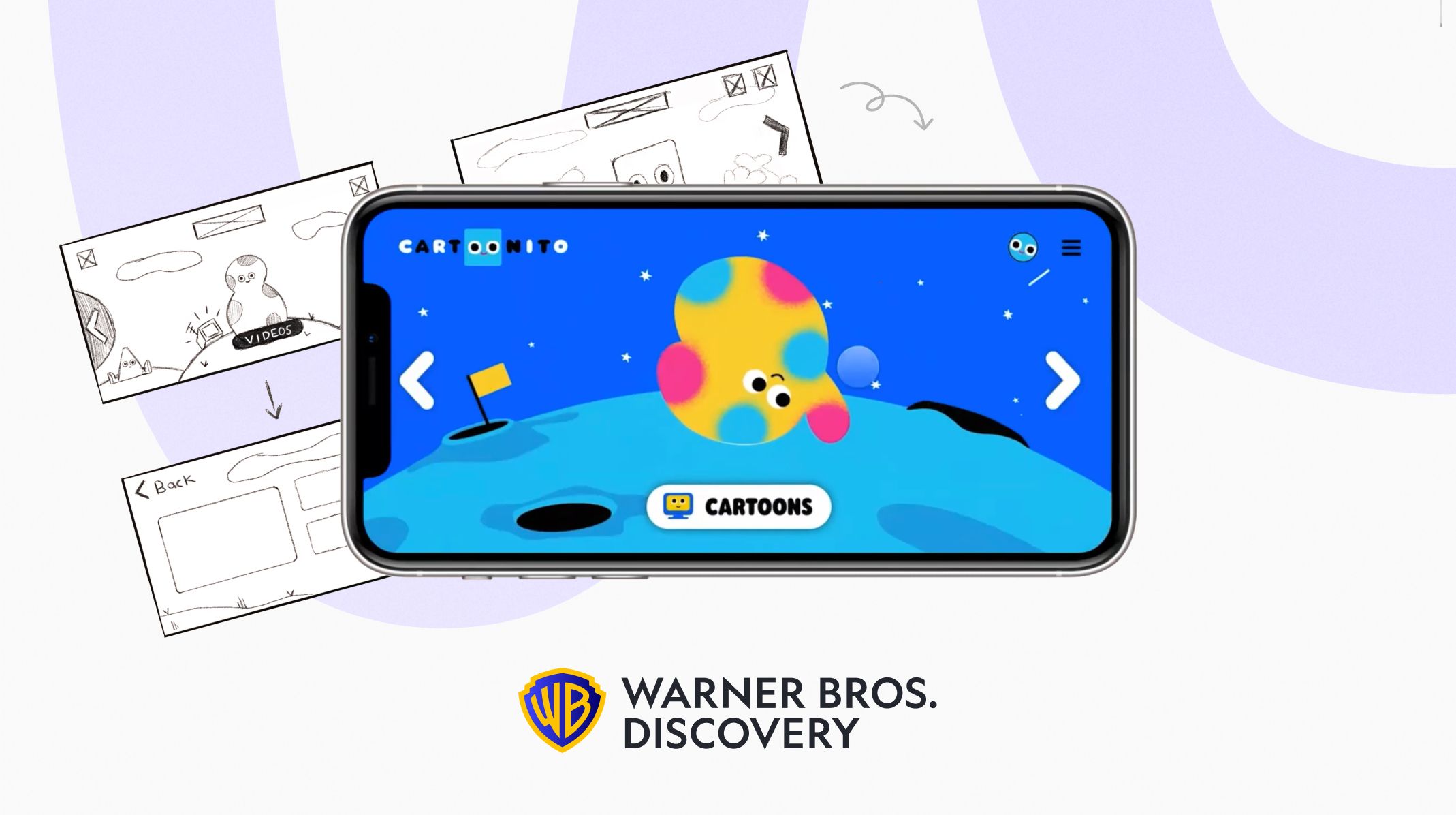
When developing products, design teams don’t have it easy. Especially not when it comes to motion design, which is often treated as an afterthought in the design process.
But, user pain points and stakeholder concerns aren’t going to solve themselves. That is why you need motion design to create good user experiences in the face of imminent deadlines.
No one knows this better than Mia Vidamour, Motion Designer at Warner Bros. Discovery. She works as part of an international team responsible for two of their brand products.
In our recent webinar, Mia told us that her work places her at the intersection of product design and motion design, and it is in this area where she finds ProtoPie most valuable. Read on to find out how her team used our tool to create prototypes for one of their recent app projects—which ended up looking exactly like the final, successful product.
Motion design is an important, but overlooked, tool in the design process
People naturally attribute social meaning to animated shapes and movements. It goes to show that even if you do not intend for there to be an expression from your motion design, the end user can still use it to interpret meaning.
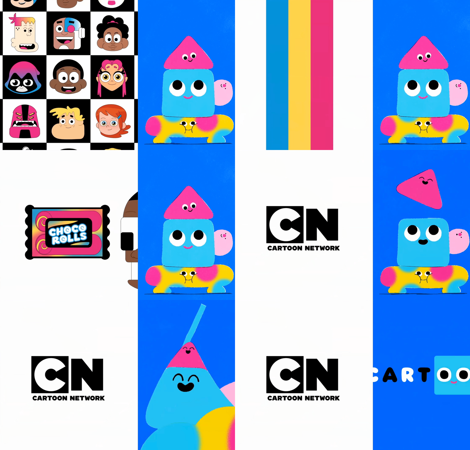
With that in mind, the Warner Bros. Discovery team uses motion design as a tool for
- Directing attention to objects and page elements on the site or app.
- Orientating users on the site or app, or by establishing spatial relationships between certain objects and page elements.
- Solving complex design problems as motion can create emphasis and prescribe meaning.
- Brand expression, as branding is very important in their field. As a result, the team finds it important to create expressive, lively and vibrant motion designs that can communicate their brand when developing new features.
However, as mentioned earlier, motion design can often be a deprioritized part of the design process.
With that in mind, how do you promote and champion motion design to prove its value?
At Warner Bros. Discovery, their solution is to start early. If motion design can be identified as a solution early in the design process, it makes it a lot easier than waiting until the end of a project when timelines and release dates are tight.
Using motion design to build good UX products
In one of their recent projects, the team revamped the design of the Cartoonito app, a programming block for kids aged 2-5 years old.
The project was entirely motion-led and heavily dependent on high-fidelity prototypes to communicate the team’s interactive and innovative approach.
Their challenge was to explore new ways of content discovery on the app for 2-5-year-olds. Keeping their target users in mind, they identified the navigation bar as a particular problem space because:
- Not all 2-5-year-olds can read.
- The icons were quite small.
- The overall navigation interface needed more visuals and interactive features to encourage the users to explore and discover the app.
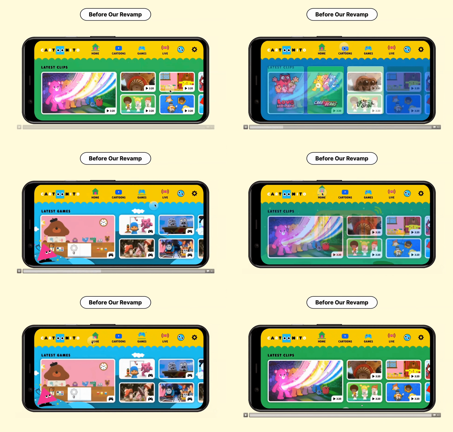
Overall, the app needed to become more user-focused and aligned to allow their end users to find great content with ease and intuition.
After user research, the team decided they needed to:
- Simplify the UI by limiting the touch interactions and having large navigational arrows on the edge of the screen.
- Add more visuals as children rely heavily on physical feedback rather than text.
- Develop more interactions as children expect to be able to interact with on-screen characters with sound and animation.
The team developed two ideations, and decided to go for a spinning world concept that spins around to a new section when you hit the right arrow. As a result, the interface became clearer to users and it had more space for adding more illustrations and interaction down the line.
However, while the new navigation system is simpler from a user perspective, it has a lot of moving parts to consider in the product design and innovation stage.
For example, the new navigation system has a selected state which is a block color, and then gradient transitory states which allows for a smooth transition when the user navigates.
It also has several layers like a navigation overlay, a static paging element, illustrations and title, a rotational dynamic element, background and a solid static element.
This meant the team needed something more tangible that they could give their stakeholders on the project so they could feel for themselves how it worked.
Basically, what they needed was a high-fidelity prototype, and that’s exactly what they were able to make with ProtoPie.
Watch the following video and learn more about how the Warner Bros. Discovery team uses ProtoPie.
How the Warner Bros design studio uses ProtoPie in their workflow
Using ProtoPie, Mia’s team was able to create complex prototypes easily just by:
- Importing everything from Figma using the integration plugin.
- Building the navigation system from scratch after some trial and error.
- Adding custom-made body character animations and putting them on the prototype to promote the interactive element of the app. As you can see in the illustration below, whenever you hit the right arrow, it spins the world. This lets the user transition into exciting and immersive sections.
Nonetheless, for the first iteration, there were some concerns as two taps were needed to access the actual content. However, as it is an app used to live stream video games, users would need to see the content front and center.
So, the team went back to the research and development stage. They eventually decided to:
- Add an interactive menu on the top.
- Adjust some iterations.
- Move some menu elements around.
- Put the cards just at the bottom of the screen to encourage users to click on them to explore and discover around the app.
Both of these iterations needed prototypes, as they are simple navigation systems with a lot of complex parts in the background.
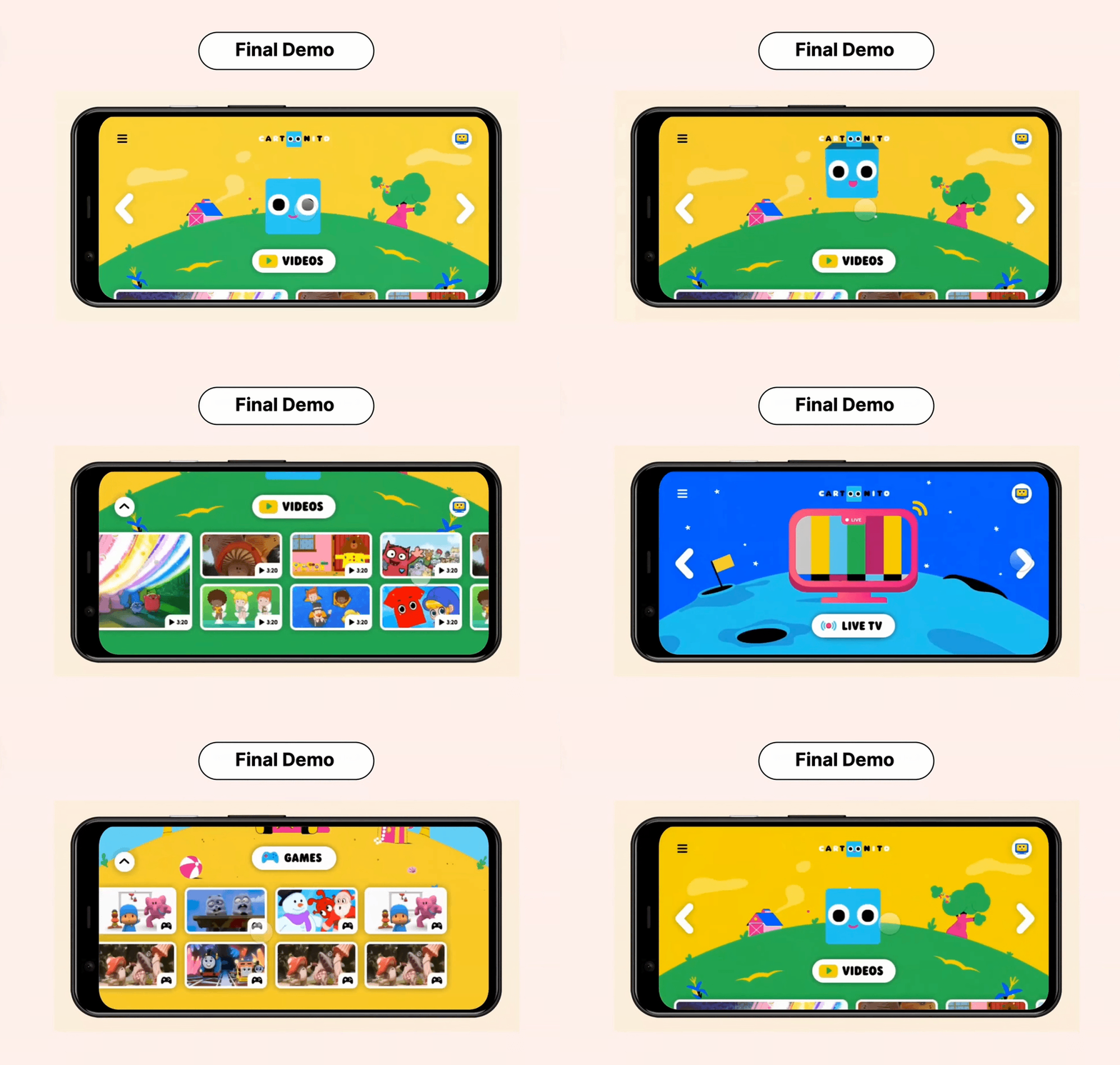
It was really valuable for the team to create a prototype because they could identify issues such as scalability. If they were to add more content in the first iteration, they would need to adjust where it scrolls. So, for the final demo of the project, they added more interaction features to keep the content accessible at all times.
The best part of doing this with ProtoPie was the ProtoPie Player, which let them physically put the prototype in the hands of their team members with no development required. Using this feature, you can share your prototype with anyone who has a link.
Since they are an international team, it meant that their teams in Latin America could download the ProtoPie player on their phone, which was a game changer that really sold the concept.
In addition to ProtoPie player, the team found three other features particularly valuable:
- The ProtoPie-LottieFiles integration
- Conditions
- Variable interactions
High-fidelity prototyping with the LottieFiles integration
LottieFiles is an AfterEffects plug in that allows you to export animations from AfterEffects to .json files.
This is a feature that not a lot of prototyping apps support, but we are happy to say that ProtoPie is an exception to this.

For the team at Warner Bros. Discovery, they found this feature really helpful as it meant they could test the .json files before handing them over to developers.
The illustration below displays how the Warner Bros design studio implemented LottieFiles in their high-fidelity prototyping using ProtoPie.
You can see five different LottieFiles, including the two looping palm trees and confettis meant to assemble in interaction points. In addition, whenever you tap on an animated character, it goes from an idle state and then does a little flip.
Building complex interactions in ProtoPie
To demonstrate the functionality of the spinning world concept, they needed the illustration layer to move down as you scroll down on the top UI layer.
They were able to achieve this interaction through using a chain reaction and mapping the scroll of the paging container to offset the world layer. This allowed for the illusion of both layers moving down in real time.
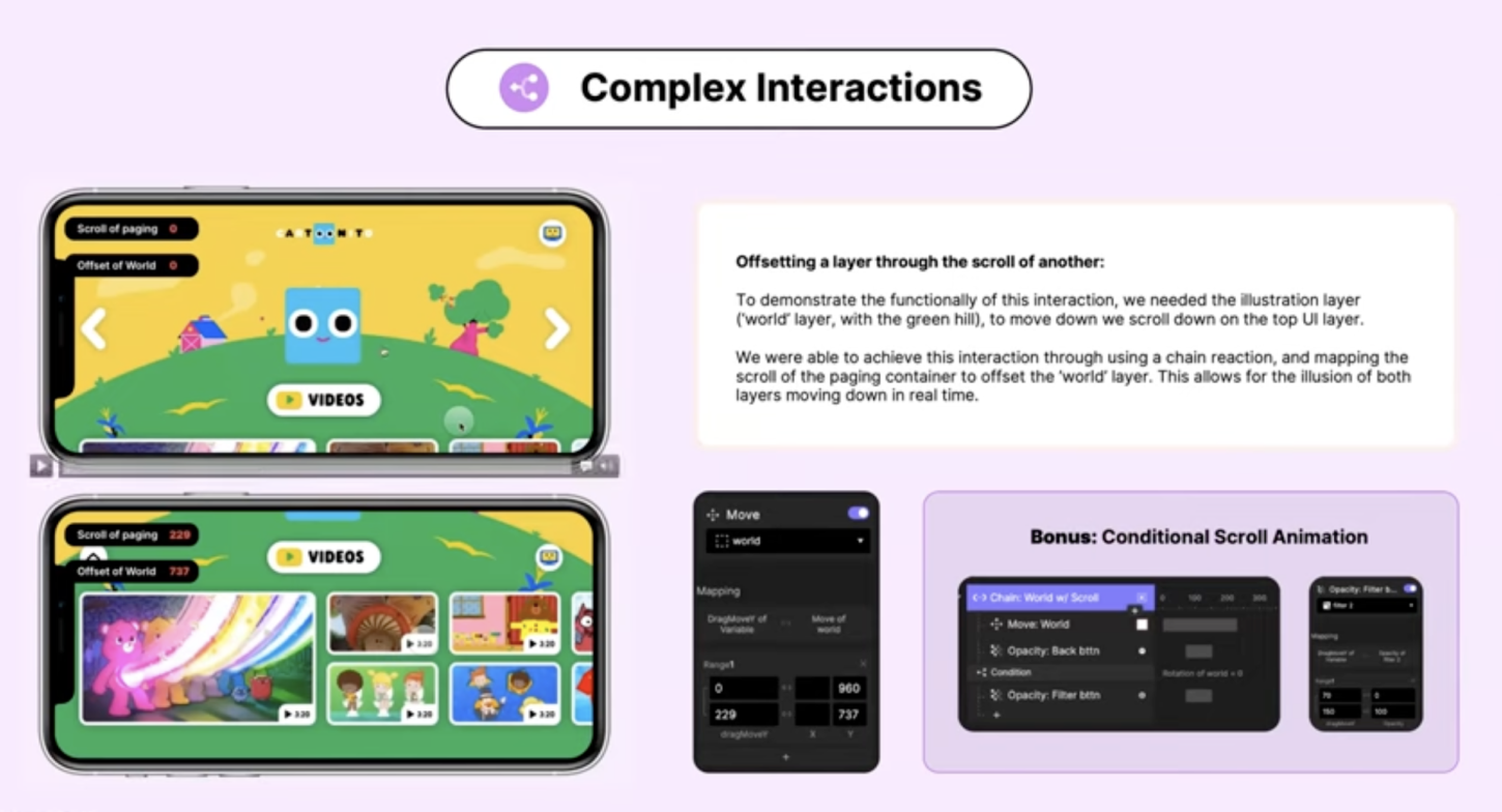
With the same interaction, you are also able to put in scroll animation. Whenever you are halfway up the scroll, two buttons appear that are triggered by the scroll.
Another feature they wanted was the filter button to only appear on the videos page, which they were also able to do using conditions.
A simplified documentation and handoff stage
In the documentation and handoff stage, ProtoPie was a real time saver for the motion design team at Warner Bros. Discovery.
The prototype had a lot of interactions on top of each other, which can make it hard to navigate. To handoff some of these elements using AfterEffects, they would need to work out how many frames were in a second and convert it into milliseconds.
With ProtoPie, that is already done for you in seconds.
As part of the overall documentation process, the design team uploads everything into Confluence, which includes:
- Page introductions
- Embedded Figma files
- Recordings of Lottie Interactions
- ProtoPie prototypes
- Animation timelines and other assets.
The page serves as a single source of truth for everything, and is interlinked with Jira to serve as a point of reference for product managers, developers and quality analysts. The team finds this a powerful way to document the handoff, and ProtoPie fits nicely into their workflow.
Following a successful handoff, the revamped Cartoonito app was deployed a couple of months ago.
The end result? Happy stakeholders, satisfied users and an app that looks exactly like the prototype they made with ProtoPie.
ProtoPie makes motion and interaction design easy
Talk to us to discover how ProtoPie can help your design team create hi-fi prototypes in record time!