UX for Wearables : Your Ultimate Guide
UX design for wearables is growing in importance with nearly half of all Americans using smartwatches, a trend on the rise.

When you think about UX for wearables, you’d be forgiven for asking yourself “how hard can it be?”. The screen real estate is usually less than half that of a smartphone (even less if you consider today’s “phablets” becoming the norm). Smartwatch UX has written its own set of rules, with UX designers working on the UX of wearables having to learn how to deliver an efficient and convenient experience.
What is wearable technology?
Wearable technology refers to electronic devices that you can wear on your body. These wearable devices are usually designed to track data or provide convenient functionality through embedded technology.
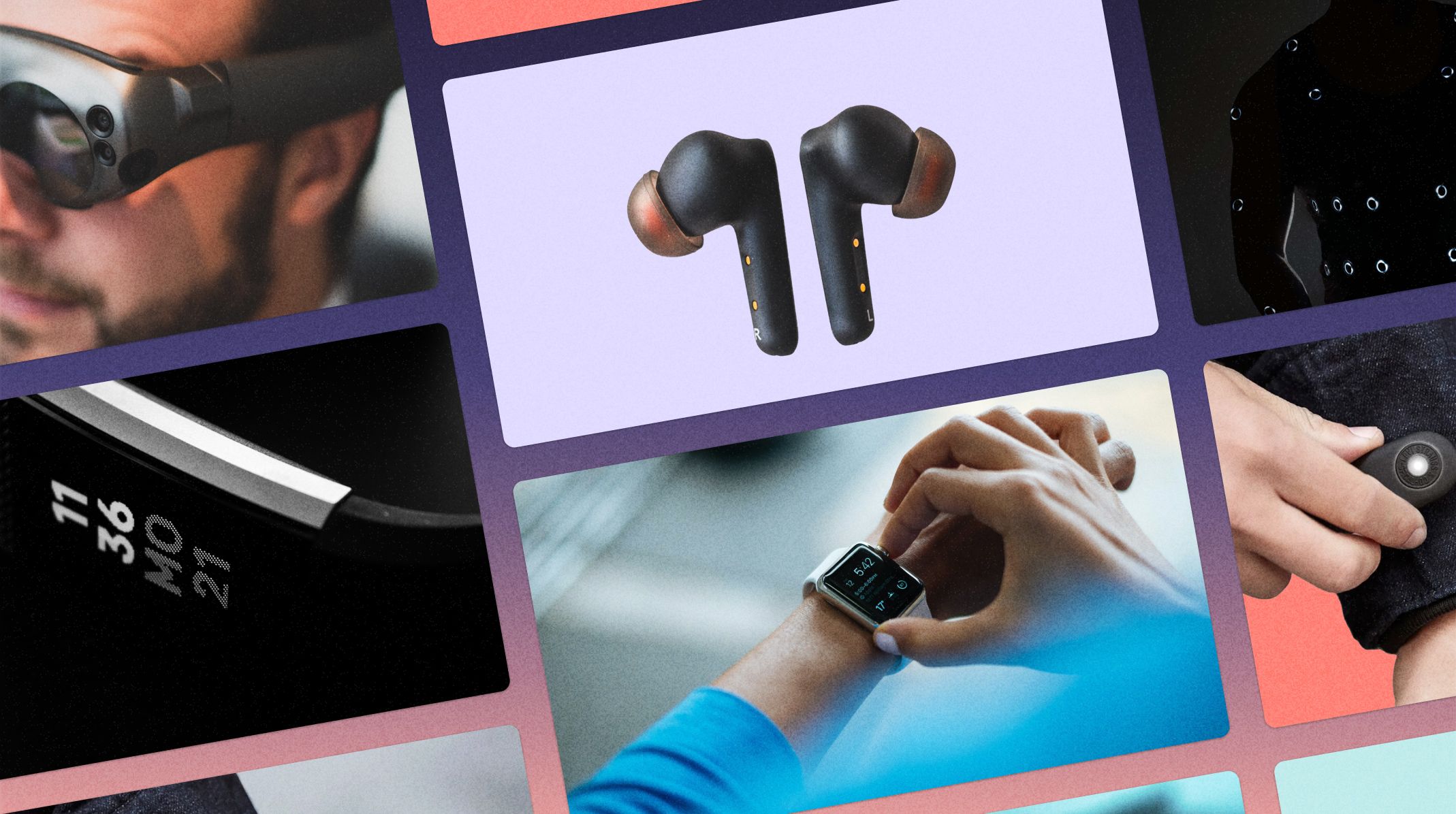
You probably think of a smartwatch when reading about wearable devices. Through innovation and the shrinking size of microchips, you can now wear all sorts of devices, such as:
- Smartwatches
- Smart earphones that accept voice commands and interact directly with your smartphone
- Smart glasses designed to augment reality and provide the wearer with information overlaid into the real world
- Smart clothing with embedded sensors to track metrics, provide haptic feedback, or even answer calls and change tunes
- Smart rings providing on-the-go payments and activity tracking
What does UX for wearables mean?
With the majority of wearable devices being screenless, UX design for wearables is quickly overlooked. It’s important to remember that each wearable device will be connected to at least one other in order to correctly function.
For example, the data that is tracked on a screenless smart ring will need to be shared with a smartphone at some stage. In this case, the wearable UX design will focus on the steps to initiate the connection, the steps to transfer the data, and the design of the app itself.
The same goes for smart clothing. Some only have sensors or haptic feedback, whereas others offer touch controls that respond to specific commands. In this case, your wearable UX design will focus on those triggers and interactions between the wearable smart clothing and the smartphone apps it interacts with.
As the variety of trackable data expands, so does the number of potential interactions between wearable devices and smartphone apps. This is where UX for wearables is an essential part of any product design, as the majority of interactions are across multiple devices.
UX design without a screen
The vast majority of wearable devices are smartwatches with small screens. But for the rest, you need to build cross-device interactions with triggers designed from common sense. If a wearable device user prefers to (or needs to) look at their paired smartphone to complete an interaction that can be achieved with the wearable, then your UX design needs to be improved.
Interaction Cost - the key to successful UX design for wearables
Without a screen, most wearables rely on an initial tutorial and then practical triggers that provoke intuitive interactions. A smart ring will have multiple touch triggers, and potential haptic feedback. The simple action of swiping your finger on the ring in a specific place or direction may trigger an outcome. If this outcome is counterintuitive, say swiping to the right plays the previous song in a playlist, users will struggle with regular use and may even drop your app altogether.
What is Interaction Cost?
Interaction cost is the sum of efforts it takes a user to accomplish an action. With interaction cost for wearables UX design, the goal is to make things so simple that muscle memory just takes over.
By following a simple UX for wearables playbook, keeping interaction costs low becomes a natural occurrence rather than a chore:
- Build to specific needs that are considered core functionality
- This in turn will keep functionality bloat to a minimum
- Design with specific use cases in mind
- Remember that less is more (particularly valid for navigation)
Different people will experience different levels of interaction cost, especially if they have less fluency with wearable devices or are color blind. As long as you keep things simple, especially when designing UX for wearables without a screen, you should achieve great results.
UX design for wearables with a screen: smartwatch UX
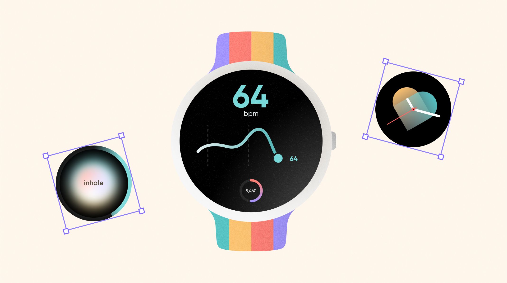
We can talk about the importance of responsive design, the mobile-first approach, or making sure that your product works across multiple devices (the latest flagship phone will have more power under the hood than the average device). All of these concepts apply to UX design for wearables. This is especially true for wearable devices without a screen, as the focus will be on interactions between the wearable and an app.
But smartwatch UX is in a league of its own.
How to approach UX for wearables with small screens?
Back in 2019, the Pew Research Center said that 1 in 5 US adults wear a smartwatch or a fitness tracker. A recent ValuePenguin survey has nearly 1 in 2 wearing a smartwatch on a regular basis. There are simple reasons behind this growing trend: we’re more health conscious, we love data, and the devices are starting to have real benefits such as time-saving and improved health.
Between Wear OS and WatchOS, there are hundreds of smartwatches and fitness trackers out there. The one thing they all have in common: their screens are small. Take the iPhone 14 and the Apple Watch 8 for example. The former has a 6.1-inch screen, with the watch’s screen at 1.78 inches. That’s 30% of the screen real estate when working on UX for wearables. So how can you approach smartwatch UX design with such a restrictive canvas?
Design your smartwatch UI with glanceability in mind
When working on a tiny screen with limited space, you need to make sure that the key information is brought to the forefront. This information has to be obtained at a glance:
- Interactions need to last seconds
- UX flows need to be as simple as possible
- Essential information is the driving factor
Smartwatch UX design needs to rhyme with convenience. A key question to ask any UX designer for wearables would be “if grabbing a phone is simpler, then why bother?”.
To answer this question and explore concepts on real hardware, you need the right tools. Smartwatch prototyping is a segment of UX design in its own right, and more companies are turning towards industry-leading solutions to achieve beautiful designs built on convenience.
If you’re looking to up your Smartwatch UX game, ProtoPie has built a Smartwatch prototyping product that even the team at Google Wear OS use. Don’t take our word for it, hear it from the folks at Google.
What are the core concepts of UX design for smartwatches?
We’ve covered glanceability, but this is just one of the many core concepts to keep in mind when working on UX for wearables with screens such as smartwatches. Let's dive down the UX designer rabbit hole and cover the core concepts that can make or break your smartwatch prototypes.
Core functionality
When you have less than a third of the screen space to make magic happen compared to a traditional smartphone, you need to be concise. When approaching UX for wearables, identifying your core functionality is more important than ever.
Identifying your core functionality may not be as cut and dry as you would like to think. But if you are running usability tests for your smartwatch prototypes from the ideation phase, then you will have an easier time identifying core functionality. We’ve covered high-fidelity prototyping and usability testing, which go hand-in-hand and can help with your smartwatch prototypes.
Once identified, you can build your smartwatch UX and smartwatch interface to the specific needs of your target audience. Core functionality can be something as simple as reading a message, or controlling a fitness app when working out. It gets harder when taking into account the variety of devices and different screen sizes, resolutions, and processing power.
In the end: keep it simple.
Responsiveness
There is nothing worse for UX design, especially in UX for wearables than sluggish interactions and unreadable fonts. These two factors combined will have users dropping your smartwatch prototype and customers asking for refunds in a flash.
Responsiveness in smartwatch UX is double-faceted:
- Design with different screen sizes in mind: this means choosing adaptable fonts and colors that will still be distinguishable on lower-quality screens.
- Interactions cannot be sluggish - there is nothing worse in smartwatch UX than having a user twist and turn their wrist to get a gesture to work the way they intended.
As processes and technology evolve, so do the opportunities afforded to UX designers. You can now build voice interactions into your smartwatch prototypes. Just because it’s voice detection, doesn’t mean you can get away with a less responsive experience! Even your voice smartwatch UX needs to be sharp and simple, just like on our prototypes:
Visual design and navigation
Due to the smaller screen size more care is going to be needed when it comes to elements such as typography and fonts. Add to this the variety in screen resolutions and quality, and you can quickly have multiple devices which cannot accurately show your desired smartwatch UI.
Typography and fonts
As most use cases for smartwatches are to display data in real-time that is available at a glance, typography and fonts are a core part of any smartwatch interface. Here are a few suggestions to keep frustrations (and interaction cost) low:
- Choosing small or thin fonts will lead to readability issues, especially on WearOS devices with varying screen sizes and color gamuts
- Focus on native fonts to reduce potential compatibility issues (keep things simple)
- If you do use custom fonts be weary of potential issues and run extended usability tests specifically targeting the smartwatch UI
Colors
Beyond the standard decisions around color palettes such as deciding which emotion you want to channel or distinguishing yourself from the competition, colors play a key role in smartwatch UX design.
They help to create a strong UI hierarchy in such a small space. Paired smartly with shapes and buttons, you can reinforce the hierarchy and provide clear navigation paths to your users. The goal as always with smartwatch UX is to provide effective interactions.
Navigation
Both typography and colors contribute to easier navigation and lowering the interaction cost of your wearable UX. As always with navigation on such small screens, breaking-up information across multiple screens and having logical user flows will be the most effective approach.
Deciding how users will navigate from the early ideation phase is a great way to keep it simple and build great wearable UX. Less is more when it comes to a less than two-inch screen, so choosing the right navigation model will make a huge difference.
Choosing the right navigation model requires some planning (and testing). You probably want to avoid hierarchical tree models, as the space requirements and potential to go multiple layers deep can end up counter-intuitive on small screens. Nested lists however are a great option for smaller screens, especially when it comes to smartwatches, as you’ll have the option to use buttons, dials, and a touch screen to navigate the menu. Finally, going for a page-based model will keep it simple, and allow for lateral navigation that other models prohibit. This is particularly great when designing wearable UX, as swiping left or right on a smartphone screen is a mindless gesture that takes seconds.
Although we can suggest best practices and what can potentially work, each product is different. Prototyping for apps or wearables is a key part of your product design process, and shouldn’t be overlooked. We’ve put together the 6 reasons why you should prototype wearables, and how your customers (and product) can benefit.
Notifications and animations are a part of the smartwatch UX experience
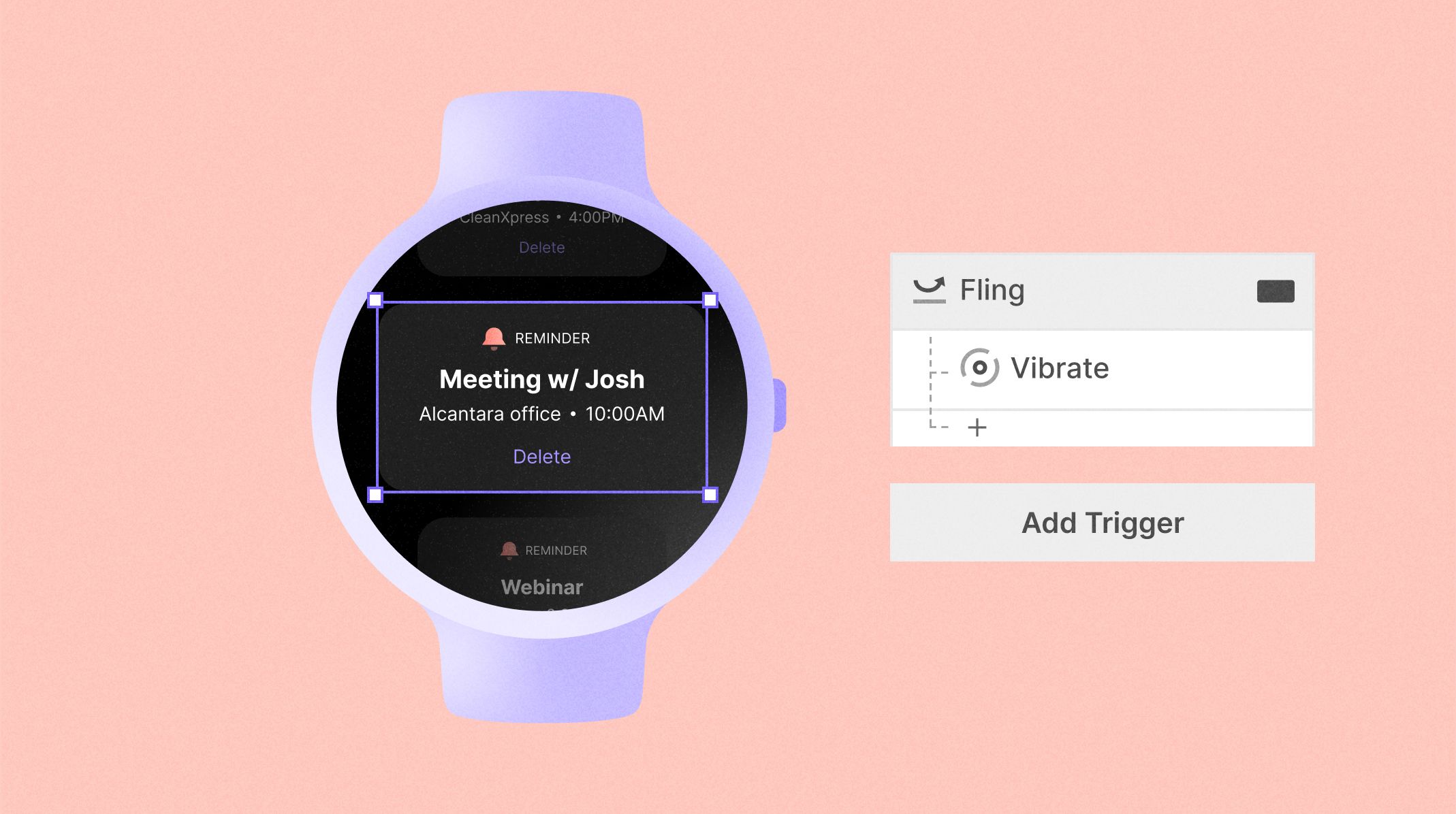
Watches tell the time, providing actionable live data. This level of simplicity and direct approach to data hasn’t changed for wearables (nor should it change). With this in mind, creating a wearable UX that works requires bringing key information, in real-time, to the forefront of your design.
Smartwatch notifications need to be meaningful and non-invasive
One of the main ways to make this key information available with such a reduced screen size is through notifications. Notifications have the added advantage of supplanting the smartwatch UI, and can be handled in many ways:
- Provide customizable options such as haptic feedback and editable notification sizes and colors
- Make them obvious so as to not be missed, but easily dismissable with a single trigger
- Refrain from including any sensitive information in a notification that shows on the screen
Haptics is not only great for letting you know that some important information is available. They allow you to multiply micro interactions without taking up more expensive screen real estate. Haptics is also a great tool for gamification and increasing that dopamine rush, which is a key part of choosing the right notifications.
Animations can make smartwatch UX fun, but shouldn’t be a priority
If there is one thing you can cut when designing wearable UX, it’s animations. The point of a smartwatch, or any watch, is getting important information at a glance. Animations do not really fit this objective, but they do have their benefits.
By including a low volume of animations in your smartwatch UX product design, you can once again multiply interactions without being overwhelming. Essentially achieving a similar goal to notifications, without the need to provide essential information. In the same way that haptic feedback can provoke a sense of satisfaction, animations provide this through their smoothness.
It’s not all plain sailing though. Too many animations or simultaneous animations can cause information bloat or even device slowdowns. This is particularly true for lower-end devices such as the Apple Watch SE or some of the WearOS devices from lesser-known brands. Animations are expensive being heavy on memory and processor usage. This means using them sparsely, but using them well. Here are some ideas for great animations:
- Including some menu bump animations, especially if you’ve chosen a nested list navigation model
- As the screen size is limited, you’ll most likely keep secondary information on other screens - animate the screen transitions to give the user some smooth satisfaction
- Great wearable UX cannot exist without surprising moments: use animations to wow your users
Do you want to add animations to your prototypes for smartphones or smartwatches? Learn more about animating your UI designs with Lottie and ProtoPie.
Are images wearable UX friendly?
We can’t talk about smartwatch UX best practices without covering images and media such as videos. Whatever the social media platform, video looks to be today’s preferred media type. But does it fit on a smartwatch UI?
You can use media on smartwatches, but you want to keep images and videos to a minimum. There are some use cases where offering a short video or some images may work, such as for a fitness app to illustrate a specific exercise. Although an acceptable use case, there are some rules to follow when displaying images and videos on a smartwatch.
- Keep the quality low - there is no point in displaying a 4k video on a wearable screen
- Prefer images in a JPEG format so as to preserve resources
- Accept that you will put a strain on the wearable device hardware, and drain the battery
When in doubt - use the wearable devices’ associated smartphone app
A wearable such as a smartwatch is seldom used solo. In fact, you cannot use an Apple Watch without pairing it with an iPhone. This presents unique opportunities when working on UX for wearables as you can use the interactions between the two devices, as well as the extra screen space, to create some amazing wearable UX designs.
You can use this relationship between the devices to lead with convenience on the smartwatch, and then provide more content on the smartphone. Check out our complete guide to ProtoPie Connect to find out just how easy we’ve made cross-device prototyping.
Successful UX for wearables also relies on the UX designer successfully establishing a relationship between the two devices. This relationship has to be balanced. You do not want your user reaching for their smartphone too frequently. But providing too much information via the wearable device can lead to frustration and confusion. Good luck!
Prototyping your smartwatch apps is the best path to bringing your designs to life
As a prototyping company offering a prototyping product, of course, this is our line. But that doesn't make it any less true. As smartwatches gain in popularity, so do smartwatch prototypes. The number of apps being released is beyond reason and with such small screens and limited power, distancing yourself from the competition often comes down to the finer margins in your smartwatch UX.
Building your UX designs on a piece of software and seeing them on a computer screen is one thing, but what about being able to see the real thing? The idea is that you can build your ultimate prototype from the comfort of your laptop or desktop monitor, and simply display it on a real smartwatch rather than a simulation. The seamless process means easier testing and iterating, and a realistic prototyping experience from day one.
You can even go one step further with built-on cross-device compatibility. UX for wearables doesn't stop with the smartwatch interface, you also need to test the app and the interactions between the two. With realistic prototyping for wearable devices, you can make sure that your UX design matches your initial desired outcomes.
Usability testing is also a key part of the prototyping process. With built-in usability testing functionality, you can use Protopie for smartwatch UX, and streamline your entire design process.
