A Designer’s Journey to Discovering ProtoPie
Meet Anna Rzepka, and find out why she chose ProtoPie among other prototyping tools in the market.


Rapid high-fidelity prototyping has become a critical part of the product design stage.
Immovable images just don’t cut it anymore. After all, there are stakeholders to impress. Deadlines to meet. And markets move faster than ever before.
UX designers are under increasing pressure to provide prototypes that look and feel like the real thing, complete with complex animations and rich interactions.
Anna Rzepka, a senior UX/UI designer from Cracow, Poland, was under such pressure. But the prototyping software she was using couldn’t quickly deliver the complex and beautiful prototypes she needed.
She needed to find a rapid high-fidelity prototyping tool that could bridge the gap between the design, engineering and business departments.
We spoke to her about her journey to ProtoPie: the problems she encountered with previous prototyping tools, why she turned to ProtoPie, and how ProtoPie helped streamline and turbo-charge her workflow.
My journey to ProtoPie
I’m a UX/UI designer by trade, but now my work involves developing beautiful design solutions that run in tandem with business strategy – bridging the gap between the design, engineering and business departments.
Figma began as my primary prototyping tool – from drafting diagrams and drawing vector illustrations to putting all the visual elements together.
But times have changed – still images aren’t enough to fully convey app behavior. In short, Figma alone wasn’t enough.
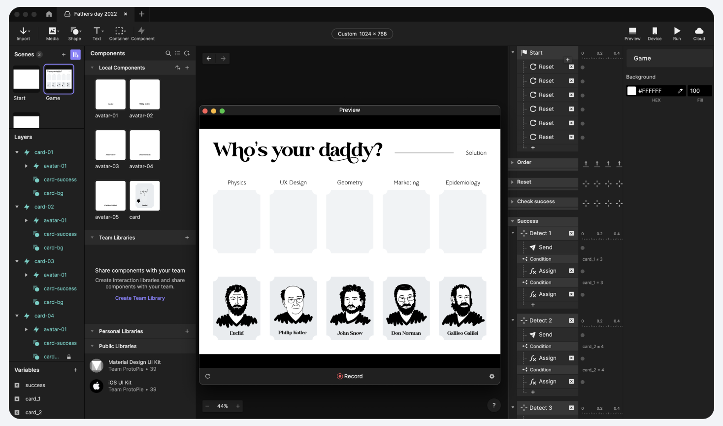
It had become increasingly challenging to make complex interactions. Although Figma has the Smart Animate feature, there’s no timeline to precisely adjust keyframes. Neither is there conditional logic, advanced formulas, nor variables. I kept on having to compromise, and high-fidelity prototypes were hard to build.

I tried everything. Some tools were great for designers but useless for engineers and troublesome for stakeholders.
For instance, getting the hang of Principle was a cinch. I could make screen transitions in a blink of an eye. Annoyingly, it’s only available for Mac users and our programmers use Windows.
I tried out Flinto, curious about its Behaviour Designer. The idea of creating micro-interactions without transitioning to a new screen was tempting. Yet once again, sharing merely video recordings with my teammates became tedious.
Origami gave me a lot of control over my UI animations, and the Patch Editor reminded me of Blender Nodes. It was a let-down to find out you need to install the software to preview the files.
I put high hopes in Framer. It allowed me to write my code and fully unleash my creativity. But more often than not, it was overkill.
I downloaded ProtoPie to test the waters ten months ago and quickly discovered that it was just what I needed – a powerful prototyping tool that connected the worlds of design, business, and technology.
ProtoPie was the missing piece of my workflow puzzle.

Why I chose ProtoPie
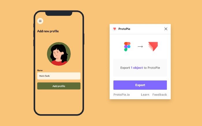
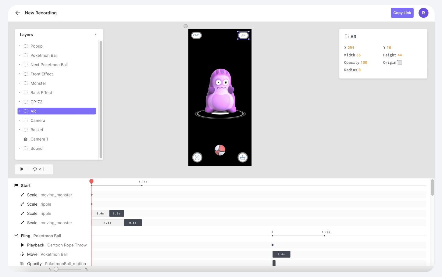
ProtoPie hit the sweet spot. It works with Figma, offers lightning-fast prototyping, and developers can inspect every property from the Interaction Recordings without installing anything.
Learning ProtoPie was easy and endlessly rewarding. I could quickly build my first high-fidelity prototypes with little effort and seamlessly share them with my colleagues – regardless of operating system or software.
Getting started was simple. There were plenty of resources to jump-start prototyping – detailed documentation, step-by-step tutorials, and online workshops. Moreover, example files to learn some handy tricks from other designers.
ProtoPie tickled the curious part of my brain. I love experimenting and exploring unknown grounds and ProtoPie allowed me to push through previously insurmountable creative horizons.
In the end, it was genuinely fun. Never before had I enjoyed playing with a piece of software this much. To put it mildly, I was in love – I wasn’t just using ProtoPie at work, I was playing around with it after hours.

What struck me most of all was the mind-blowing extent of control it gave me. I could create immersive experiences in the blink of an eye. I didn’t need GIF workarounds because I could use my production-ready Lottie animations. Not to mention, everybody could effortlessly view my prototypes in a browser or on mobile devices.
How ProtoPie streamlined my workflow
ProtoPie allows me to be creative and incorporate animations into my visuals. To my mind, ProtoPie adds a pinch of spice to my creations.
ProtoPie helps me quickly build complex micro-interactions and test different concepts – invaluable when I want to show clients how new features will look when implemented.
ProtoPie is an incredible time-saver, enabling me to streamline my process and significantly boost productivity. Rapid prototyping allowed me to test concepts without involving developers. It was a substantial cut-back in spending and helpful when it came to developer handoff.
And most importantly, ProtoPie improved communication within our teams. The Interaction Recordings leave no space for any guesswork.

I currently work on an e-commerce drugstore assignment where I extensively use micro-interactions. ProtoPie allows me to guide the users through the flow. Also, it helps manage eye focus and highlight the essential layout elements.
Additionally, it helps establish a consistent brand voice and image. It’s visible clearly when something on the website goes wrong. Empty states, error pages, and invalid inputs are perfect spots to try something more playful and fun.
ProtoPie enables me to tell a story and drive conversions in places usually considered a dead-end.
The horizon is endless with ProtoPie
More than 15,000 companies trust ProtoPie to fulfill their prototyping needs. Schedule a demo to discover ways ProtoPie can help your teams succeed.